Bootstrap 
api/framework developed by Twitter for mobile first, responsive (to changing devices it is displayed on) web sites/applications.
Setup on Webstorm or command line
If you don’t use the Webstorm IDE you have to go through the steps of downloading bootstrap and manually setting up (see appendix B of the Getting MEAN book)
Bootstrap Patitioning of Screen (regardless of device-phone versus tablet versus computer) = 12 columns
RESPONSIVE = Bootstrap will rearrange the columns depending on size of the screen
Target Sizes in Bootstrap
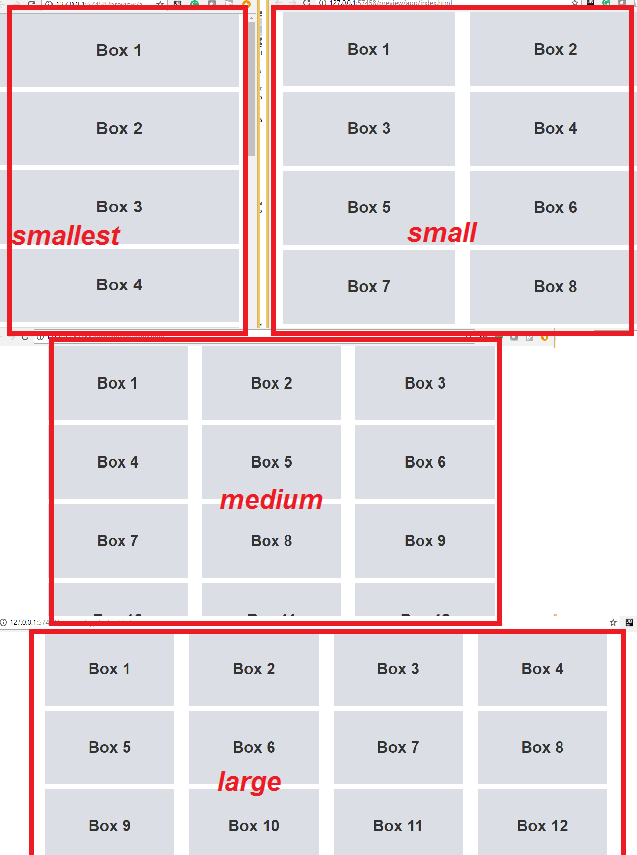
Say we have 12 content areas we want to layout such that as shown in the previous image we have
- lg device = each div(item) takes up to 3 columns (hence 12/3 = 4 items in a row)--> this is specified by the col-lg-3 class attribute below
- md device =each div(item) takes up to 4 columns (hence 12/4 = 3 items in a row)--> this is specified by the col-md-4 class attribute below
- sm device =each div(item) takes up to 6 columns (hence 12/6 = 2 tiems in a row) --> this is specified by col-sm-6 class attribute below
*******CLICK HERE TO SEE THE CODE BELOW********
</div></div>


