Topic 2: 2] Penn State's
Uncertainty Vis. center http://www.geovista.psu.edu/research/uncertainty/
Also look:
ebox.mcs.csuhayward.edu/~cs99111/proj4.htm
Outline
Qing Tang
The paper introduces a project to visualize uncertainty and reliability of map-referenced data. For this project a geographic visualization system has been developing by Penn State's Uncertainty Visualization center over the past decade. Now they are working in this project continually.
Issues discussed and solved in this project include:
- Techniques for visually representing uncertainty or reliability of geo-referenced data;
- Categorization of kinds of uncertainty in the geo-referenced data;
- Interface Design for visualization systems (what kind of user interface is most effective)
Two highlighted examples given in this and its referenced papers:
1) Visualization of uncertainty in data from weather forecast models and actual weather data.
Different colors are used to represent the uncertainty of the data from models and actual data (agree or disagree in the data).
Animation techniques are applied to show the results over times(From 2, 4, 6 to 48 hours).
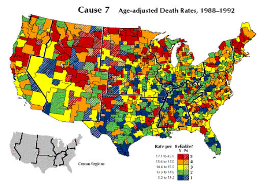
2) Visualizing geo-referenced data: representing reliability of health statistics: Age-Adjusted death rate(1988-1992)
A color fill to represent data and a texture overlay to represent reliability

In a summary the visualization techniques used in this project include color, interactive animation, dynamic and sonic variable.
To visualize the uncertainty and reliability of the map-related data, more interactive control button should be adopted when design a user interface, e.g. zoom in and zoom out button, dynamic link button to more detail information and data.

