| CS2020: Web Science, Sytems and Design | ||||||
|
Heavy Content Web Sites: Search
modified from http://ijhcs.open.ac.uk/shneiderman/shneiderman-nf.html
Four-phase framework for search
Searching textual databases can be confusing for users because of the diverse task situations and numerous interface features. Popular search systems for the World Wide Web (such as Lycos, Opentext, or Alta Vista) and stand-alone search systems usually provide a simple interface inviting users to type in keywords and then providing a relevance-ranked list of 10 to 50 result items. This is appealing in its simplicity, but users are often frustrated as they do not know what the results mean, nor can they control aspects of the search. Evidence from empirical studies shows that users perform better and have higher subjective satisfaction when they can view and control the search (Koenemann and Belkin, 1996).Furthermore, when using multiple search systems, users find a disturbing variety and inconsistency in features. For example, a search for the string 'user interface' could produce the following:
- Search on the exact string 'user interface'
- Probabilistic search for 'user' and 'interface'
- Probabilistic search for 'user' and 'interface' with some weighting if the terms are in close proximity
- Boolean search on 'user' AND 'interface'
- Boolean search on 'user' OR 'interface'
- Error message indicating missing AND/OR operator or other delimiters
An analogy to the evolution of automobile user interfaces might clarify
the situation. Early competitors offered a profusion of controls and each
manufacturer had a distinct design. Some designs, such as having a brake
that was far from the gas pedal, were dangerous. Furthermore, if you were
accustomed to driving a car with the brake to the left of the gas pedal,
and your neighbor's car had the reverse design, it might be risky to trade
cars. It took a half century to achieve good design and appropriate consistency
in automobiles, but let's hope we can make the transition faster for text-search
user interfaces.
To coordinate design practice, a four-phase framework seems possible
to satisfy the needs of first-time, intermittent, and frequent users accessing
a variety of textual libraries (Shneiderman, Croft, and Byrd, 1997). Finding
common ground will be difficult; not finding it will be tragic. While early
adopters of technology are willing to push ahead to overcome difficulties,
the middle and late adopters will not be so tolerant. The future of search
services on the World Wide Web and elsewhere may depend on how well user
frustration and confusion are reduced, while enabling them to reliably
find what they need in the rapidly surging sea of information.
The four-phase framework gives great freedom to designers to offer features in an orderly and consistent manner. The phases are formulation (expressing the search), initiating action (launching the search), review of results (reading messages and outcomes), and refinement (formulating the next step).
- Formulation includes the following:
- Source: search the appropriate libraries and collections.
- Fields for limiting the source: structured fields such as year, media, or language, and text fields such as titles or abstracts of documents.
- Phrases to allow entry of names such as George Washington or Environmental Protection Agency, and concepts such as abortion rights reform or gallium arsenide.
- Variants.: to allow relaxation of search constraints such as case sensitivity, stemming, partial matches, phonetic variations, abbreviations, or synonyms from a thesaurus.
- Action, which may be performed:
- Explicitly by a button with consistent label (such as "Search"), location, size, and color.
- Implicitly by changes to a parameter of the formulation phase which immediately produces a new set of search results. These dynamic queries, in which users adjust query widgets to produce continuous updates, have proven to be effective and satisfying.
- Review of results in which users do the following:
- Read explanatory messages.
- View textual lists.
- Manipulate visualizations.
- Control of the size of the result set and which fields are displayed
- Change sequencing (alphabetical, chronological, relevance ranked,...).
- Explore clustering (by attribute value, topics, etc.).
- Refinement
- Meaningful messages guide users in progressive refinement; for example, if the two words in a phrase are not found near each other, then easy selection of individual words or variants should be offered.
- Changing search parameters should be convenient.
- Search results. and the setting of each parameter can be saved, sent by email, or used as input to other programs, for example visualization or statistical tools.
The four-phase framework can be applied by designers to make the search process more visible, comprehensible, and controllable by users. This is in harmony with movement toward direct manipulation in which the state of the system is made visible and under user control. Novices may not want to see all the components of the four phases initially, but if they are unhappy with the search results, they should be able to view and change them easily. A revised interface for the Library of Congress' THOMAS system (Figure 8), shows how it might be applied to text searching on full-text searching of proposed legislation.
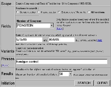
Figure 8: A revised interface for the Library of Congress' THOMAS system, showes how the four-phase framework might be applied to text searching on full-test searching of proposed legislation. [http://www.cs.umd.edu/projects/hcil/People/bas/experiment/test10.html]
Textual search interfaces are only one approach to finding information on the Web. Visual information seeking is likely to play an increased role as network bandwidth and screen resolution increases, and as designers create effective strategies for presenting comprehensible, predictable, and controllable interfaces. Some hypertext and menu-selection notions can be reengineered to fit the Web context, others will have to be invented specifically for this novel environment.
Exploration with Information Visualization:
Substantial progress in recent research on information visualization is likely to have a profound effect on commercial systems. Visual overviews of an entire database by starfields (zoom-able scattergram of color points), tree diagrams, treemaps (nested rectangles that show hierarchies), parallel coordinates, network diagrams, and other strategies are making visual browsing and dynamic filtering viable. As users select widgets such as sliders, buttons, and maps, the result list is changed, often within 100 milliseconds, thereby enabling rapid exploration (Ahlberg & Shneiderman, 1994; Shneiderman, 1994; Shneiderman, 1996). The Visual Information Seeking strategy is: Overview first, zoom and filter, then details-on-demand.Visualizations are also being created to show three-dimensional search environments (Card et al., 1996) and to present text search results (Hemmje et al., 1994; Rao et al., 1995; Wise et al., 1995). Research efforts are being widely applied to visualization of websites, traversal histories, and search results (Tauscher and Greenberg, 1997 [this issue]). While visualizations can be powerful they can also be complex and confusing, but research is improving our understanding of what works and when.
Query Previews:
For large collections, especially when searching across the Web, search actions can be split into two phases. First, a rapid rough search that previews only the number of items in the result set, and then a query refinement phase that allows users to narrow their search and retrieve the result set (Doan et al., 1996).For example, in searching for a restaurant (Figure 9) the query preview screen gives users limited choices with buttons for the type of food (e.g. Chinese, French, Indian), double-boxed range sliders to specify average price of a main course and the times that the restaurant is open, and maybe a map to specify rough regions. As users make selections among these attributes, the query preview bar at the bottom of the screen is updated immediately to indicate the number of items in the result set. Users can quickly discover that there are no cheap French restaurants in downtown New York, or that there are many Caribbean restaurants open after midnight. When the result set is too large, users can restrict their criteria and when the result set is too small they can relax the constraints.
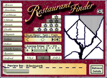
Figure 9: Restuarant finder demonstrates the query preview idea. User can quickly adjust the parameters and see the effect on the size of the preview bar at the bottom. Zero-hit or mega-hit results are immediately visible and users can always be sure that their search will provide an appropriate number of results (Graphic disign by Teresa Cronell) (Doan et al., 1996).
Query previews require database maintainers to provide an updated table of contents that users can download from the server. Then users can perform rapid searches on their client machines. The table of contents contains the number of items satisfying combinations of attributes, but the size of the table is only the product of the cardinality of the attributes, which is likely to be much smaller than the number of items in the database. With twelve kinds of restaurants, eight regions, three kinds of charge cards, a simple table of contents would contain only 288 entries. Storing the table of contents burdens users who may have to keep tables of contents (1000 to 100,000 bytes) for each database that they search. Of course the size of the table of contents can be cut down dramatically by simply having fewer attributes or fewer values per attribute. These burdens seem moderate when weighed against the benefits, especially if users search a database repeatedly. The table of contents is only as big as a typical image in a website and it can be automatically downloaded for use when Java applets are used.
Query previews are being implemented for a complex search on NASA environmental databases. Users of the existing system must understand the numerous and complex attributes of the database that is distributed across eight archival centers. Many searches result in zero hits because users are uncertain about what data is available, and broad searches take many minutes while yielding huge and unwieldy result displays. The query preview uses only three parameters: dates (clustered into 20 one-year groups), locations (clustered into eight geographic regions), and 171 scientific parameters (cloud cover, ocean temperature, ozone, etc.) (Figure 10). This comes to a total of 20 * 8 * 171 = 27360 data values in the table of contents. In the prototype, users can quickly discover that the archive held no ozone measurements in Antarctica before 1979. Once a reasonable sized result set is identified, users can download the details about these data sets for the query refinement phase.
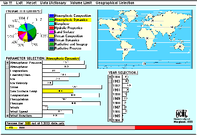
Figure 10: NASA query preview applies this technique to a complex search for professional scientists. The set of more than 20 parameters is distilled down to three, thus helping speed search and reduce wasted efforts. Users select values for the parameters and immediately see the size of the result bar on the bottom, thus avoiding sero-hit and mega-hit queries.
Compactness and high branching factors
The most discussed issues in webpage design are length and number of links (branching factor). A very long page with no links is appealing only if users are expected to read the entire text sequentially. This is rarely the case, so some form of home or index page to point to fragments is necessary. Meaningful structures that guide users to the fragments they want is the goal, but excessive fragmentation disrupts those who wish to read or print the full text. As the document and website grow, the number of layers of index pages can grow as well, which is a severe danger. One way to reduce disorientation is to provide users with a visual overview of the web site (Figure 11).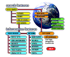
Figure 11: Network diagram of the Lycos search web site is called a sitemap. [http://www.lycos.com/sitemap.html]
A higher branching factor is almost always preferred for index pages, especially if it can save an extra layer that users must traverse. The extra layers are more disorienting than longer index pages, as was demonstrated in menu selection studies (Norman, 1991). In a redesign for the Library of Congress homepage (http://www.loc.gov) (Figure 12) the seven links to general themes were replaced with a compact display with 31 links to specific services. The Yahoo home page has almost 100 links in a compact two-column presentation.
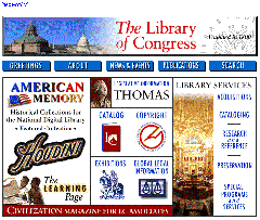
Figure 12: Library of Congress home page reflects the changing policies that emphasize the educationally oriented resources of the 200 American Memory special collections. [http://www.loc.gov]
Within a page, compact vertical design to reduce scrolling is recommended (Staggers, 1993). While some white space can help organize a display, often webpages contain harmful dead space that lengthens the page without benefit to users. A typical mistake is a single left-justified column of links that leaves the right side of the display blank, thus forcing extra scrolling and preventing users from gaining an overview. A second common mistake is to use excessive horizontal rules or blank lines to separate items (Horton et al., 1996).